Next Project

Strengthening Redwood’s roots.

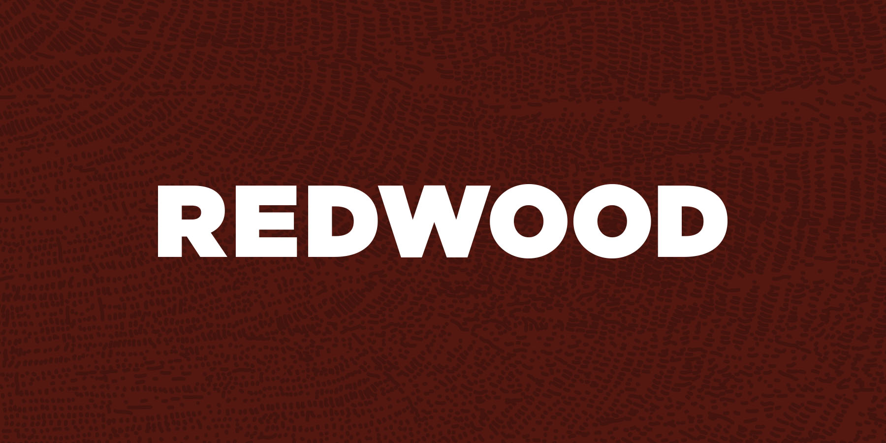
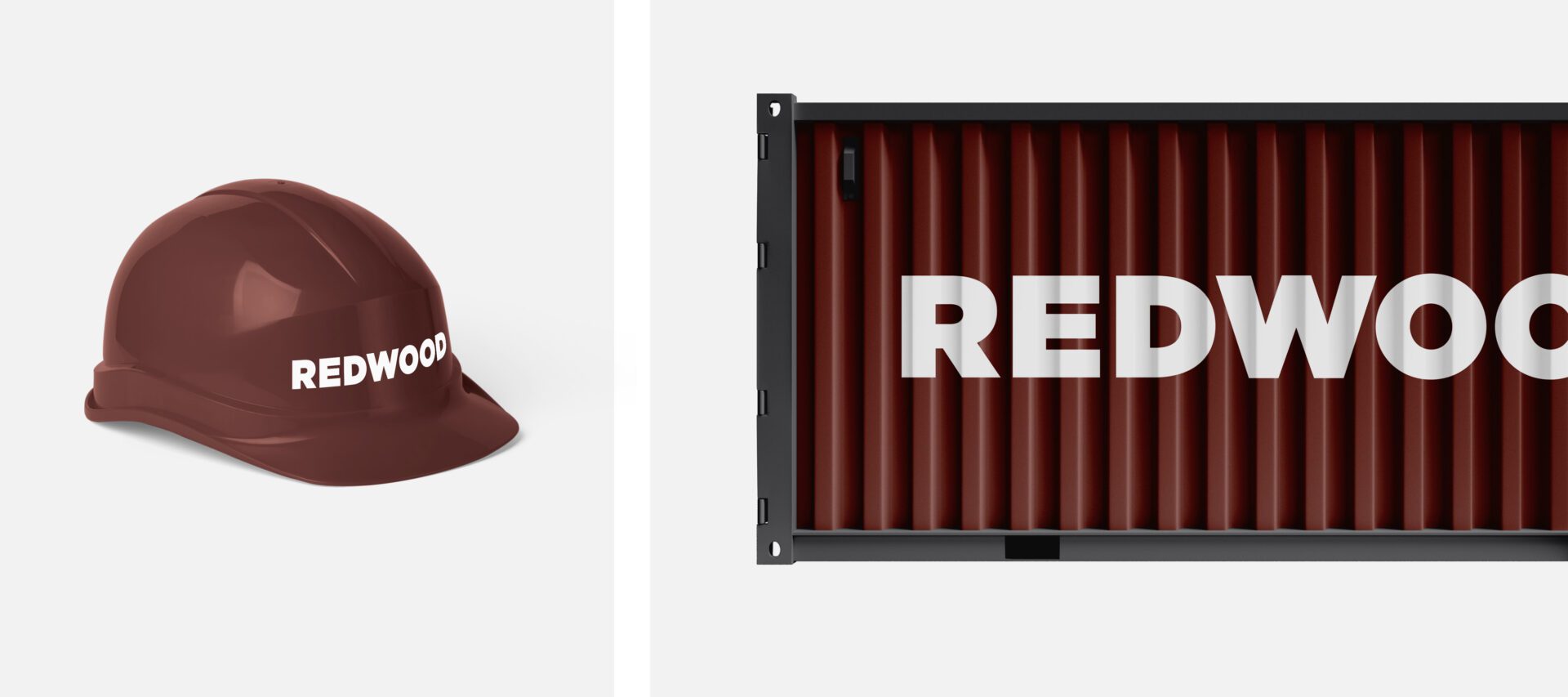
How do we convey more sturdiness and stability in a brand?

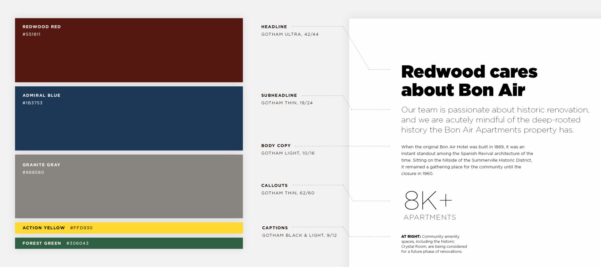
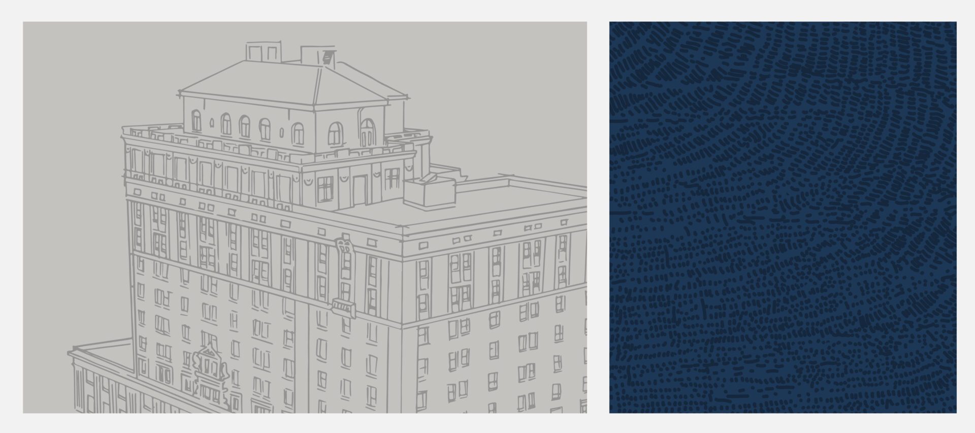
Redwood Housing approached us with this very question, challenging us to add a sense of solidity and gravity to their logo and brand. We started by shifting their wordmark from hand-drawn lettering to a bold sans-serif. Next, we built a palette of rich primary colors and strong typography that establishes Redwood Housing as a confident, go-to provider of quality management and development in their field.

View the site >

Redwood Housing logo wordmark on background tree ring texture
Redwood Housing brand color and typography palette

To offset the boldness of the core brand pieces, we introduced hand-drawn elements in the form of textures and illustrations. Sketched tree-rings and building line drawings are used as background elements, while a series of full-color building illustrations are used as the primary imagery for case studies.

hand-drawn building illustrations of various Redwood Housing properties

This approach allowed us to introduce animations for the properties that transition from line drawing to aerial drone videography.

Using the core pieces, we were able to push the brand out to a variety of applications and assets that help Redwood expand its presence on job sites and in the office.

Redwood Housing polo shirts

Illustrations by Freyja Whitney; Video production by Bryan Tucker.

See Next Project