The dark and dated former home of the Art Institute of Seattle will be bright and thriving once again.
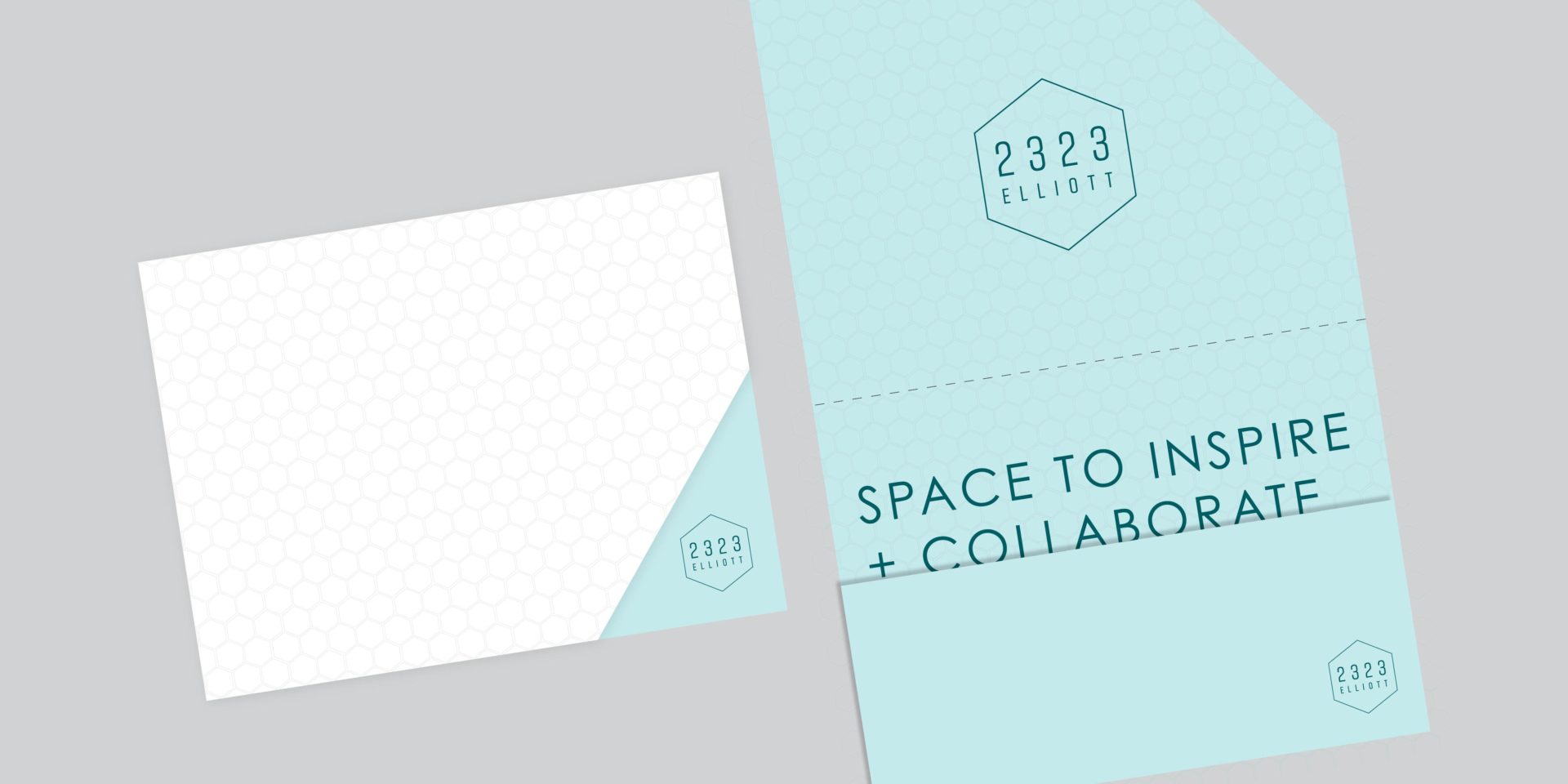
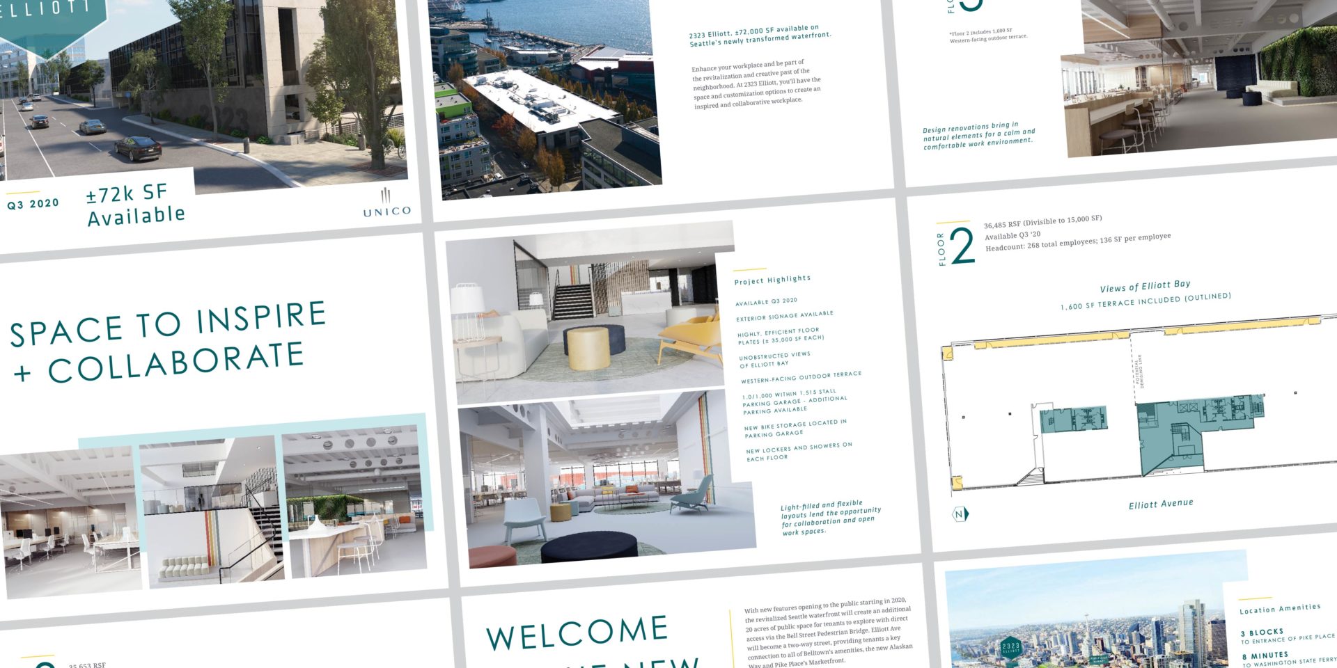
We created a new logo and updated brand direction to match the modern interior and exterior renovations to the building. Our logo concept mimics the accent wall in the entryway which includes a hexagon mural. The overall color palette was inspired by Elliott Bay’s natural light and elements, which are now a focus of the space. We created both web and print materials for the property including a custom website to feature their marketing video and an embossed brochure folder for leasing materials.

